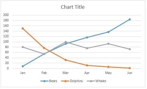
Making graphs and charts is part of most of the people doing a job in sales and marketing departments. These people show the previous, present, and future forecasts in the form of graphs and charts. Many experts say that graphs and charts are the best way to visualize data clearly.
Moreover, finance and accounting department professionals need to learn how to forecast larger volumes of data in graphical form. In this article, you will learn how to make graphs or charts in excel.
Step 1: Create Chart/Enter Data:
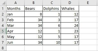
Enter the data in the excel sheet as shown in the figure.
Step 2: Select the Data:
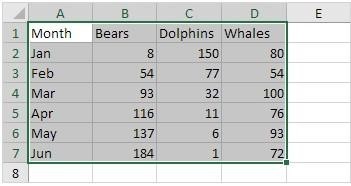
Now select the data for which you want to show in graphical form. From the picture, select A1:D7.
Step 3: Select Chart/graph Type:
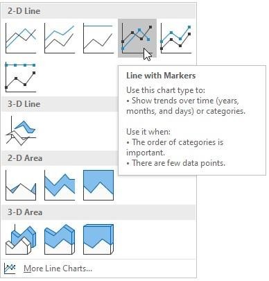
Click the Insert Button/Tab, and select the chart or graph type. In the insert tab, you will find a lot of options like Pie charts, Bar graphs, Column graphs, and Dotted area graphs.
Step 4: Enter Data on Axis:
On the selected graph or chart, scroll down and enter the data for the axis.
Step 5: Color Adjustment:
After entering data, select the color scheme and data layout if you are comparing more than 2 values.
Step 6: Adding Elements:
With the help of chart elements, which is a chart filter in some versions, you can customize the look of the graph, add titles on the axis, and may change data.
Step 7: Tittle the Graph:
Finally, add the title of the graph and click ok.
Step 8: Adding Addition Features:
After the final graph is OK, you can add additional features by clicking anywhere on the graph.
